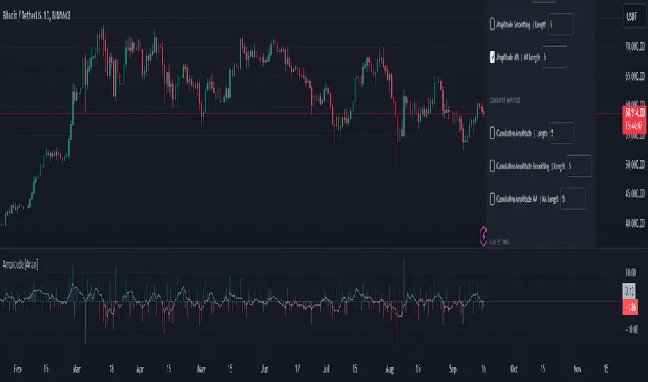
Amplitude [Anan]The Amplitude indicator calculates and visualizes both the amplitude and cumulative amplitude of price movements, providing traders with insights into price volatility and trend strength. By distinguishing between positive and negative amplitude movements, this indicator aids in identifying bullish and bearish sentiments, potential reversal points, and confirming trend directions.
█ Main Formulas
‣ Amplitude = High - Low
‣ Cumulative Amplitude = sum of Amplitude over the specified lookback period
‣ Percentage Amplitude = (Amplitude / Open) × 100%
High: Candle high (or highest high when lookback > 1)
Low: Candle low (or lowest low when lookback > 1)
Open: Open price of the first candle in the lookback period
█ Key Features
✦Dual Amplitude Calculations:
Amplitude: Reflects price range and direction over a short-term period.
Cumulative Amplitude: Aggregates amplitude over a longer period for broader trend analysis.
✦Customizable Parameters: Adjust lookback periods, smoothing options, moving averages and Alerts.
✦Direction Separation: Distinguish between positive and negative amplitude movements to identify market sentiment.
✦Flexible Visualization: Customizable colors and plot styles for enhanced chart readability.
✦Alert System: Generate signals based on amplitude direction and moving average crossovers
█ How to Use and Interpret
✦Understanding Amplitude and Cumulative Amplitude:
‣Amplitude: Measures the price range (high - low) over a specified short-term period.
‣Cumulative Amplitude: Aggregates amplitude over a defined longer-term period.
‣Percentage Representation: shows amplitude relative to the open price from `amp_length` bars ago, providing a normalized view.
‣Interpretation:
Large Amplitude Values: Indicate high volatility.
Small Amplitude Values: Indicate low volatility.
✦Trend Identification:
‣Uptrend: Consistently positive amplitudes and upward-moving averages.
‣Downtrend: Consistently negative amplitudes and downward-moving averages.
✦Overbought/Oversold Conditions:
‣High Positive Amplitude: May indicate overbought conditions and potential reversals.
‣High Negative Amplitude: May indicate oversold conditions and potential reversals.
✦Volatility Analysis:
‣High Amplitude Values: Suggest increased market volatility.
‣Low Amplitude Values: Suggest reduced market volatility.
✦Signal Confirmation:
‣Moving Average Crossovers: Confirm the strength and direction of trends, aiding in informed trading decisions.
✦Trading Strategies:
‣ Breakout Trading: Large increases in amplitude can signal potential breakouts.
‣ Mean Reversion: Extreme amplitude values may indicate upcoming price corrections.
‣ Volatility-Based Strategies: Adjust position sizes or trading frequency based on amplitude magnitudes.
‣ Multi-Timeframe Analysis: Compare amplitudes across different timeframes for a comprehensive market view.
█ Customization Tips
‣ Lookback Periods: Experiment with different periods to suit your trading style and asset characteristics.
‣ Smoothing Settings: Adjust to balance responsiveness and noise reduction.
‣ Percentage Amplitude: Use for normalized comparisons across different price levels.
在脚本中搜索"high low"
DTB
Dynamic Trendline Bands with Buy/Sell Pressure Detection
This indicator provides a comprehensive analysis of price movements by incorporating smoothed high and low bands, a midline, and the detection of buying and selling pressure. It is designed to help traders identify key support and resistance levels as well as potential buy and sell signals.
**Features:**
- **Smooth High and Low Bands:** Based on the highest high and lowest low over a specified period, smoothed using a simple moving average (SMA) to reduce noise and enhance clarity.
- **Midline:** The average of the smoothed high and low bands, providing a central reference point for price movements.
- **Buying and Selling Pressure Detection:** Highlights candles with significant buying or selling pressure, indicated by light green for buying pressure and light red for selling pressure. This is determined based on volume thresholds and price movement.
- **Trendlines:** Dynamic trendlines are drawn based on recent highs and lows, helping to visualize the current trend direction.
**How to Use:**
1. **High-Low Bands:** Use these bands to identify key support and resistance levels.
2. **Midline:** Monitor the midline for potential mean reversion trades.
3. **Buying/Selling Pressure Candles:** Look for candles highlighted in light green or red to identify potential buy or sell signals.
4. **Trendlines:** Follow the dynamic trendlines to understand the direction of the current trend.
**Inputs:**
- **Length:** Number of bars to consider for calculating the highest high and lowest low (default: 200).
- **Smooth Length:** Period for the simple moving average to smooth the high and low bands (default: 10).
- **Volume Threshold Multiplier:** Multiplier for the average volume to detect significant buying or selling pressure (default: 1.5).
This indicator is suitable for all timeframes and can be used in conjunction with other technical analysis tools to enhance your trading strategy.
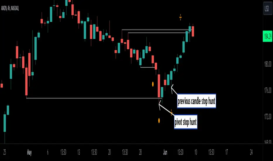
Stop Hunts [MK]Liquidity rests above/below previous highs and lows because these are the areas where traders are most likely to leave their orders/stop losses. The market can tap into this liquidity source by going beyond the previous highs and lows, this liquidity can then be used to reverse the market in the opposite direction.
As traders we may want to know if price will continue beyond previous highs and lows, or reverse the market. If price looks to be reversing after tapping into liquidity, this can be a good area to enter a trade. The same area can be used as a take profit level also.
The indicator identifies previous high/lows in two ways:
1. previous high/lows using 'PIVOT POINTS'. Pivots are easy to spot and are obvious within a price trend. Also called 'higher highs", "lower lows" etc. The number of candles required to form the pivot point can be adjusted in the script settings.
see below example of pivot point and stop hunt:
www.tradingview.com
see how price reversed upwards after stop hunt on pivot point above.
2. previous candle high/lows. A previous candles high and low are also good areas of liquidity.
see below example of previous candle stop hunt:
see how price reversed upwards after stop hunt on previous candle low above.
Personally, I use the pivot point stop hunts on lower timeframes and previous candle stop hunts on higher timeframes. However users can adjust on which timeframes to show the indicator depending on their own trading style.
As ever all items within 'settings' are customizable.
The indicator is by no means a 'trading strategy' and users should be fully aware of the stop hunt concept and have conducted extensive back-testing before using with 'live' accounts.
The indicator may also serve as a 'teaching aid' to new students and as a reminder to more experienced traders.
MarketRangerThis indicator puts a selection of elements together providing traders with insights into price dynamics, trend changes, and potential trading opportunities within the specified timeframe.
Trading Range Defined by Support and Resistance :
Support and resistance levels are calculated using the lowest low and highest high over specified periods.
These
levels define the boundaries of the trading range within which the price moves.
WMA Color Changing based on Slope :
The script uses three Weighted Moving Averages (WMAs) with different lengths.
The color of the main WMA changes based on its slope.
When the slope of the WMA is positive (indicating an uptrend), it's displayed in blue. When it's
negative (indicating a downtrend), it's displayed in pink.
New High/Low Detection :
The script detects new highs and lows in the price action.
A new high is detected when the current high crosses under the previous resistance level, and a new low is detected when the current low crosses over the previous support level.
These
detections are marked by triangle shapes above or below the bars.
WMA Crosses :
The script calculates the difference between the two WMAs.
When the faster WMA crosses above the slower WMA, indicating a potential bullish signal, a blue cross shape is plotted below the bar.
When the faster WMA crosses below the slower WMA, indicating a potential bearish signal, a
pink cross shape is plotted above the bar.
Slope Changes :
The script calculates the slope of the main WMA and tracks changes in slope.
A positive slope indicates an upward trend, while a negative slope indicates a downward trend.
Slope changes from negative to positive indicate potential bullish momentum, and from
positive to negative indicate potential bearish momentum.
Customizable Pivot Levels :
Pivot levels are calculated based on user-defined percentages of the range between support and resistance.
Pivot Level 1 and Pivot Level 2 provide additional reference points for potential reversals or trend continuation.
Usage :
The indicator provides support and resistance levels, new high/low alerts, and WMA crosses.
The midpoint and customizable pivot levels offer potential trading zones.
Slope change points indicate potential shifts in market sentiment.
Customize the pivot levels according to your trading strategy.
Parameters :
Adjust the WMA lengths and support/resistance lengths to suit your trading style.
Modify the visibility settings to control how many periods of support and resistance are displayed.
Customize the pivot levels to fit your preferred trading strategy.
Alerts :
Alerts are triggered for new high/low points and WMA crosses.
Use alerts to stay informed about potential trading opportunities.
Interpretation :
Watch for new high/low points for potential trend reversals or continuations.
Monitor WMA crosses and slope changes for signals of market direction.
Consider trading near support/resistance levels and pivot points.
Additional Notes :
Experiment with different settings to find the configuration that best suits your trading preferences.
Backtest the indicator on historical data to validate its effectiveness before using it in live trading.
Advanced MACD [CryptoSea]Advanced MACD (AMACD) enhances the traditional MACD indicator, integrating innovative features for traders aiming for deeper insights into market momentum and sentiment. It's crafted for those seeking to explore nuanced behaviors of the MACD histogram, thus offering a refined perspective on market dynamics.
Divergence moves can offer insight into continuation or potential reversals in structure, the example below is a clear continuation signal.
Key Features
Enhanced Histogram Analysis: Precisely tracks movements of the MACD histogram, identifying growth or decline periods, essential for understanding market momentum.
High/Low Markers: Marks the highest and lowest points of the histogram within a user-defined period, signaling potential shifts in the market.
Dynamic Averages Calculation: Computes average durations of histogram phases, providing a benchmark against historical performance.
Color-Coded Histogram: Dynamically adjusts the histogram's color intensity based on the current streak's duration relative to its average, offering a visual cue of momentum strength.
Customisable MACD Settings: Enables adjustments to MACD parameters, aligning with individual trading strategies.
Interactive Dashboard: Showcases an on-chart table with average durations for each phase, aiding swift decision-making.
Settings & Customisation
MACD Settings: Customise fast length, slow length, and signal smoothing to tailor the MACD calculations to your trading needs.
Reset Period: Determine the number of bars to identify the histogram's significant high and low points.
Histogram High/Lows: Option to display critical high and low levels of the histogram for easy referencing.
Candle Colours: Select between neutral or traditional candle colors to match your analytical preferences.
When in strong trends, you can use the average table to determine when to look to get into a position. This example we are in a strong downtrend, we then see the histogram growing above the average in these conditions which is where we should look to get into a shorting position.
Strategic Applications
The AMACD serves not just as an indicator but as a comprehensive analytical tool for spotting market trends, momentum shifts, and potential reversal points. It's particularly useful for traders to:
Spot Momentum Changes Utilise dynamic coloring and streak tracking to alert shifts in momentum, helping anticipate market movements.
Identify Market Extremes Use high and low markers to spot potential market turning points, aiding in risk management and decision-making.
Alert Conditions
Above Average Movement Alerts: Triggered when the duration of the MACD histogram's growth or decline is unusually long, these alerts signal sustained momentum:
Above Zero: Alerts for both growing and declining movements above zero, indicating either continued bullish trends or potential bearish reversals.
Below Zero: Alerts for growth and decline below zero, pointing to potential bullish reversals or confirmed bearish trends.
High/Low Break Alerts: Activated when the histogram reaches new highs or falls to new lows beyond the set thresholds, these alerts are crucial for identifying shifts in market dynamics:
Break Above Last High: Indicates a potential upward trend as the histogram surpasses recent highs.
Break Below Last Low: Warns of a possible downward trend as the histogram drops below recent lows.
These alert conditions enable traders to automate part of their market monitoring or potential to automate the signals to take action elsewhere.
Implied Orderblock Breaker (Zeiierman)█ Overview
The Implied Order Block Breaker (Zeiierman) is a tool designed to identify enhanced order blocks with imbalances. These enhanced order blocks represent areas where there is a rapid price movement. Essentially, this indicator uses order blocks and suggests that a swift price movement away from these levels, breaking the current market structure, could indicate an area that the market has not correctly valued. This technique offers traders a unique method to identify potential market inefficiencies and imbalances, serving as a guide for potential price revisits.
The indicator doesn't scan for imbalances in the traditional sense — where there's an absence of trades between two price levels — but instead, it identifies quick movements away from key levels that suggest where an imbalance might exist. Relying on crossovers and cross-unders in conjunction with pivot points and examining the high/low within the same period provides an innovative method for traders to spot these potentially undervalued or overvalued areas in the market. These inferred imbalances can be crucial for traders looking for price levels where the market might make significant moves.
█ How It Works
Bullish
Crossover: The closing price of a bar crosses above a pivot high, which is an indication that buyers are in control and pushing the price upwards.
New Low Within Period: There is a lower low within the same period as the pivot high. This suggests that after setting a high, the market pulled back to set a new low, potentially leaving a price gap on the way up as the price quickly recovers.
Bearish
Crossunder: The closing price of a bar crosses under a pivot low, indicating that sellers are taking control and driving the price down.
New High Within Period: There is a higher high within the same period as the pivot low. This condition suggests that the market rallied to a new high before falling back below the pivot low, potentially leaving a gap on the way down.
█ How to Use
The enhanced order blocks are often revisited, and the price may aim to 'fill' the potential imbalance created by the rapid price movement, thereby presenting traders with potential entry or exit points. This approach aligns with the idea that imbalances are frequently revisited by the market, and when combined with the context of Order Blocks, it provides even more confluence.
Example
Here, if the price drops rapidly after setting a new high—crossing under the pivot low—it may skip over certain price levels, creating a 'gap' that signifies an area where the price might have been overvalued (imbalance), which the market may revisit for a potential price correction or revaluation.
█ Settings
Period: Determines the number of bars used for identifying pivot highs and lows. A higher value gives more significant but less frequent signals, while a lower value increases sensitivity but might give more false positives.
Pivot Surrounding: Specifies the number of candles to analyze around a pivot point. Increasing this value broadens the analysis range, potentially capturing more setups but possibly including less significant ones.
-----------------
Disclaimer
The information contained in my Scripts/Indicators/Ideas/Algos/Systems does not constitute financial advice or a solicitation to buy or sell any securities of any type. I will not accept liability for any loss or damage, including without limitation any loss of profit, which may arise directly or indirectly from the use of or reliance on such information.
All investments involve risk, and the past performance of a security, industry, sector, market, financial product, trading strategy, backtest, or individual's trading does not guarantee future results or returns. Investors are fully responsible for any investment decisions they make. Such decisions should be based solely on an evaluation of their financial circumstances, investment objectives, risk tolerance, and liquidity needs.
My Scripts/Indicators/Ideas/Algos/Systems are only for educational purposes!
Donch +This is an indicator I made for trading Forex to help me see the bigger picture. It is meant for the 30min TF and it includes the following:
- 20 Day High | Low
- 5 Day High | Low
- 4 Hour High | L
- 4 Hour Bars
- Daily Simple Moving Averages
- Weekly Trend Line (connects last week's open to this week's open)
- Daily Trend Line (connects yesterday's open to today's open)
- Horizontal Lines at 0.25% increments (these can be useful for S/R... currency rarely moves more than 1% in a day).
- A table with information about what markets are open and technicals on the pair I am looking at.
- A slight white background fill to highlight the first hour of the US session. Knowing what session you are in is very important in day trading (in my opinion). This lets me go back and see how the US has been trading.
To keep the chart from being "too busy" (it's plenty busy lol), I use a step line and focus on 30min closes. I reference the white lines above and below closes for 4hr highs/lows and don't bother with looking at the high/low of every 30 min bar.
For the table, you will see bright green by the country for the first hour of trading in that session. It will turn to a regular green after the first hour. It will turn yellow the final hour of that session. It will turn red if that market is closed.
You can select from the settings 'inputs' tab to enable/disable any parts of this you don't find useful, for the table you'd go over to the 'style' tab and unselect it there. For example, I don't use the labels regularly. If I were to get confused about what a moving average was or something, I'd enable the labels and clarify.
Currency doesn't like to break out and likes to be stable. Keeping this in mind, you can see how the 20 day high / low and the 5 day high / low act as support and resistance (unless there is a news event to break out on.
I have alerts for the following:
- Price update every hour
- Crossing a trend line
- Crossing a moving average
- Crossing a 0.25% increment
- Making a new 4 hour, 5 day, or 20 day high/low
To enable the alerts, you would click add alert, select the indicator, and click save. To work properly, you'd want to be on the 30min TF before doing this. You will get a lot of alerts (personally I like this because I like to see how currency moves throughout the day). You will get one notification per 30 minutes but not more than that for the particular alert.
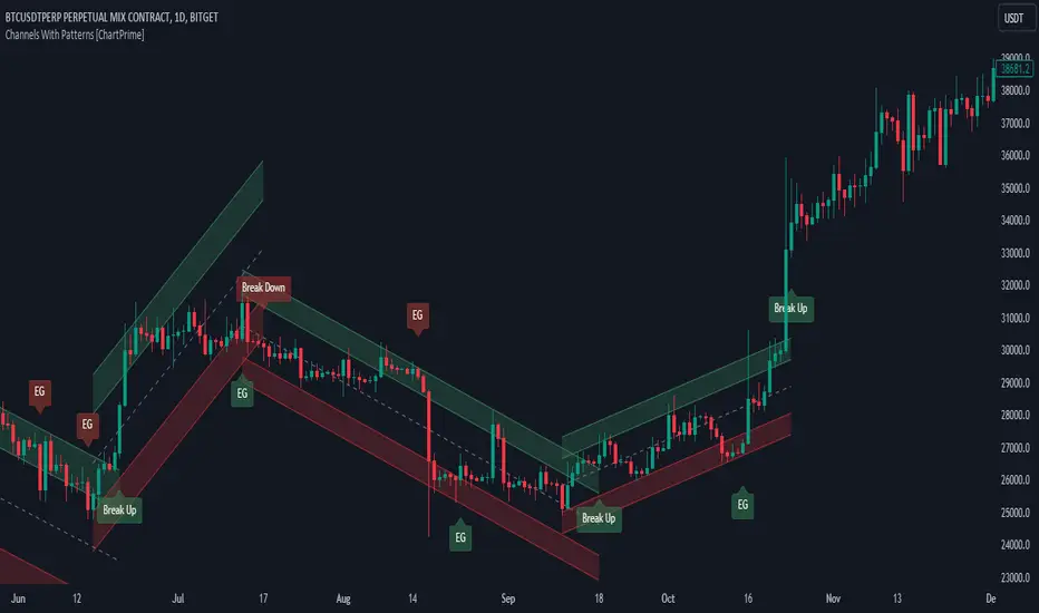
Channels With Patterns [ChartPrime]The Channels With Patterns indicator is an attempt at minimizing the delay in forming a trend channel. This indicator uses a single pivot in conjunction with a smooth version of the price to estimate the direction of an emerging trend. Using ATR, this indicator estimates the volatility of the new trend by adjusting the channel size by a multiple of the current ATR.
One of the biggest complains for any trend indicator is that it takes too long to create a channel or trend line. This indicator estimates the trend channel by checking if the price is moving in the correct direction and then it projects the channel from a single pivot. To allow for some margin of error, this script uses an offset to help center the channel.
This offset is generated from the ATR at the time of formation. In conjunction with forming estimated trend channels, this indicator features select candle stick patterns. These candle stick patterns are filtered by location in the formed trend channel. If the price is within an extremity of the trend channel it will appear. Filtering classical vanilla candle stick patterns using this methodology can result in some interesting results and possible confluence points for traders. For example; a bearish hammer appearing when filtered in an upper zone might add an extra level of realtime unique confluence traders.
Traders can use this script as a general trend line indicator that is a bit more forward looking than others, or it can be used it as its full blown trend channel estimator. Due to the fact that this is an estimate using the minimum possible information to make the channel, its accuracy will not always be perfect and can suffer compared to alternative methods.
When configuring the indicator it is important to understand the role of each input. Here is a description of all of the settings provided:
Presets (`preset`): This input allows users to quickly configure the indicator based on the market they are trading in. Selecting "Stocks," "Forex," or "Crypto" automatically adjusts various parameters to settings deemed optimal for these markets. The "User" option lets traders manually configure settings for a more personalized approach.
Style (`style`): This setting determines how pivot points are calculated. "Wick" uses the high and low of candlesticks (including wicks), which can be more sensitive to market extremes. "Body" uses only the open and close prices (the body of the candlesticks), potentially offering a more stable pivot point calculation.
Break Style (`break_style`): This option defines what price is used to determine if a channel has been broken. "Close" uses the closing price of a candlestick, while "High/Low" uses the highest and lowest prices. This affects how channel breaks are identified and can influence trading signals.
Instant Mode (`instant`): When enabled, this feature allows the indicator to form channels more quickly by initiating them as soon as potential formations are detected. This can provide earlier signals but may increase the risk of false positives.
ATR Length (`atr_length`): This input sets the period for the Average True Range (ATR), a common volatility indicator. A longer ATR period may smooth out the channel but could delay responsiveness to market changes. A shorter period might make the channel more responsive but potentially more erratic.
Offset Center (`offset`): Adjusts the vertical positioning of the channel. This can help in aligning the channel more accurately with the price action, depending on market conditions and personal trading strategies.
Size (`atr_multiplier`): Alters the channel's size relative to the ATR. A higher multiplier makes a wider channel, which might be useful in more volatile markets. A lower multiplier tightens the channel, which could be better for less volatile conditions.
Padding % (`padding`): This setting adjusts the padding within the top and bottom quarters of the channel. It essentially fine-tunes the channel's sensitivity to price movements near its boundaries.
Pivot Length (`pivot_length`): Determines the number of bars used to calculate pivot points. A longer length may provide more significant pivot points but can reduce the number of channels formed.
Pivot Look Forward (`look_forward`): Sets the number of bars to look forward in the pivot calculation, affecting how quickly the channel adapts to new pivots.
Average H/L Length (`avg_length`): Controls the smoothing of the high and low prices used in the channel calculation. A longer average length can lead to smoother, more gradual channel slopes.
Enable Hammer (`enable_hammer`): When enabled, the indicator will highlight Hammer candlestick patterns, which are often considered bullish reversal indicators.
Enable Inverted Hammer (`enable_ihammer`): This toggles the display of Inverted Hammer patterns, typically viewed as potential bullish reversal signals.
Enable Bullish Engulfing (`enable_bullish_engulfing`): Enables the identification of Bullish Engulfing patterns, another type of bullish reversal indicator.
Enable Bearish Engulfing (`enable_bearish_engulfing`): When activated, this highlights Bearish Engulfing patterns, which are often interpreted as bearish reversal signals.
Extend Channel (`extend`): This option, when enabled, extends the drawn channels forward until they are either broken or a new channel is formed.
Show Break Label (`show_break_label`): Toggles the display of labels indicating where the channel has been broken, providing visual cues for potential trade entries or exits.
Channel History Length (`history_length`): Determines how many historical channels are displayed on the chart. This can be useful for analyzing past performance and patterns.
Channel Colors (`top_color`, `bottom_color`, `center_color`): These settings allow customization of the channel's appearance by setting the colors of the top, bottom, and center lines.
Line Transparency (`line_trans`): Adjusts the transparency of the channel lines, helping to balance visibility with chart readability.
Center Line Transparency (`center_trans`): Specifically sets the transparency level of the center line of the channel.
Channel Fill Transparency (`fill_trans`): Modifies the transparency of the filled areas between the channel lines, which can enhance chart clarity and focus on the price action.
Break Colors (`break_up_color`, `break_down_color`): Sets the colors for labels that appear when the channel is broken, either upwards or downwards.
Break Label Text Color (`text_color`): Determines the color of the text in the break labels, enhancing readability based on the chart's background and color scheme.
Candle Pattern Colors (`h_color`, `ih_color`, `bullish_engulfing_color`, `bearish_engulfing_color`): These inputs allow for the customization of the colors used to highlight various candle patterns on the chart.
Candle Pattern Text Color (`candle_text_color`): Sets the color of the text for labels associated with candle pattern indicators.
Alerts (`new_channel_alert`, `break_alert`, `hammer_alert`, `ihammer_alert`, `bullish_engulfing_alert`, `bearish_engulfing_alert`): These toggles enable or disable alerts for different events, such as the formation of new channels, channel breaks, or the appearance of specific candle patterns. This feature is crucial for traders who rely on timely notifications for potential trading opportunities.
We have provided a few presets to allow you to get a feeling for how the indicator works with different settings easily. Here is a description of the settings used in each preset:
Stocks Preset:
Style: "Wick"
Break Style: False (High/Low)
Instant Mode: True
ATR Length: 10
Size (ATR Multiplier): 4
Pivot Length: 10
Pivot Look Forward: 15
Average H/L Length: 18
Forex Preset:
Style: "Wick"
Break Style: False (High/Low)
Instant Mode: True
ATR Length: 100
Size (ATR Multiplier): 5
Pivot Length: 10
Pivot Look Forward: 15
Average H/L Length: 18
Crypto Preset:
Style: "Wick"
Break Style: False (High/Low)
Instant Mode: True
ATR Length: 10
Size (ATR Multiplier): 4
Pivot Length: 10
Pivot Look Forward: 15
Average H/L Length: 18
This script first starts by defining and collecting the relevant data for the main body of the code with data(). This generates the pivot data, the levels, the ranges, the averages, the deltas, and finally the candle sticks. Once there is a higher low, or lower high detected via the pivots and the current price it triggers the formation of the new channel. It takes the delta between the last pivot and the current average price and projects the trend channel using this delta. If the price exceeds the extremities of the channel it will classify this as a break from the estimated structure and begin looking for a new channel. The idea is that when trending, the price will oscillate between extremities as defined by a range and direction. If the price is inside of one of these extremities the script will look for candle stick patterns. This is how the script operates.
On a more technical level, this script is meant to showcase Pine Script's custom types and methods. We have made use of a properties pattern allows functions to use a minimal number of arguments. This allows you to add new inputs without modifying a string of functions. The use of methods and data structures allows the main body of the code to be easy to understand and for the script as a whole to be easily modified. We have made sure that the script is modular so that users can incorporate this into their own custom scripts. It should be easy to expand on this script as the main logic is fairly compact and open for easy modification. All features are packed into their own function for easy use elsewhere. This is particularly evident in the candle stick section. I have simplified the process of creating candle stick patterns by creating a type. All users have to do is make methods for this type.
candle()=>
polarity = open < close
body_top = math.max(open, close)
body_bottom = math.min(open, close)
body_range = body_top - body_bottom
top_wick = high - body_top
bottom_wick = body_bottom - low
average_body = ta.ema(body_range, 14)
average_top_wick = ta.ema(top_wick, 14)
average_bottom_wick = ta.ema(bottom_wick, 14)
has_body = body_range != 0
has_top_wick = top_wick != 0
has_bottom_wick = bottom_wick != 0
above_average_body = body_range > average_body
above_average_top_wick = top_wick > average_top_wick
above_average_bottom_wick = bottom_wick > average_bottom_wick
candle_data.new(
polarity
, body_top
, body_bottom
, body_range
, top_wick
, bottom_wick
, average_body
, average_top_wick
, average_bottom_wick
, has_body
, has_top_wick
, has_bottom_wick
, above_average_body
, above_average_top_wick
, above_average_bottom_wick
)
In conclusion, this script offers a blend of rapid trend channel formation and candlestick pattern recognition, making it a unique tool for traders looking for a more proactive approach to trend analysis.
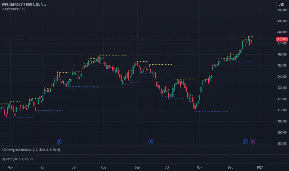
Catching Trend Reversals by shorting tops and buying bottomsHOLP (High of the low period) and LOHP (Low of the high period)
Catching Trend Reversals by shorting tops and buying bottoms
using this Swing High/Low Indicator
Trading Strategy comes from Mastering the Trade, by John Carter pg 300.
Trading Rules for Sells, Buys are reversed
1. Identifying a trending market, where today's price is making a 20-day high (17-18 day highs are also fine)
Note this is configurable by setting the trending period variable (defaults to 20)
For example if price is making a 20 period high or 20 period low, it will show a triangle up/down above the candle.
2. Identify the high bar in the uptrend
3. Go short once the price action closes below the low of this high bar
4. The initial stop is the high of the high bar.
5. If you are in the trade on the third day or period, use a 2 bar trailing stop.
You can check 2-bar trailing stop to draw the line, defaults to off.
Stop is indicated by the white dot.
Code Converted from TradeStation EasyLanguage
I can't find the original source anymore for the swing high/low plots, but if someone knows,
let me know and I'll credit here.
Euclidean Distance Predictive Candles [SS]Finally releasing this, its been in the works for the past 2 weeks and has undergone many iterations.
I am not sure if I am 100% happy with it yet, but I guess its best to release and get feedback to make improvements.
So this is the Euclidean distance predictive candle indicator and what it does is exactly what it sounds like, it uses Euclidean distance to identify similar candles and then plot the candles and range that immediately proceeded like candles.
While this is using a general machine learning/data science approach (Euclidean distance), I do not employ the KNN (Nearest Neighbors) algo into this. The reason being is it simply offered no predictive advantage than isolating for the last case. I tried it, I didn't like it, the results were not improve and, at times, acutally hindered so I ditched it. Perhaps it was my approach but using some other KNN indicators, I just don't really find them all that more advantageous to simply relying on the Law of Large Numbers and collecting more data rather than less data (which we will get into later in this explanation).
So using this indicator:
There is a lot of customizability here. And the reason is, not all settings are going to work the same for all tickers. To help you narrow down your parameters, I have included various backtest results that show you how the model is performing. You see in the AMZN chart above, with the current settings, it is performing optimally, with a cumulative range pass of 99% (meaning that, of all the cases, the indicator accurately predicted the next day high OR low range 99% of the time), and the ability to predict the candle slightly over 52%.
The recommended settings, from me, are as follows:
So these are generally my recommended settings.
Euclidian Tolerance: This will determine the parameters to look for similar candles. In general, the lower the tolerance, the greater the precision. I recommend keeping it between 0.5, for tickers with larger prices (like ES1! futures or NQ1!) or 0.05 for tickers with lower TPs, like SPY or QQQ.
If the ED Tolerance is too extreme that the indicator cannot find identical setups, it will alert you:
But in general, the more precise you can get it, the better.
Anchor Type: You will see the option to anchor by "Predicted Open" or by "Previous Close". I suggest sticking with anchoring by predicted open. All this means is, it is going to anchor your range, candle, high and low targets by the predicted open price. Anchoring by previous close will anchor by the close of yesterday. Both work okay, but in general the results from anchoring to predicted open have higher pass rates and more accurately depict the candle.
Euclidean Distance Measurement Type: You can choose to measure by candle body or from high to low wicks. I haven't played around with measuring from high to low wicks all that much, because candle body tends to do the job. But remember, ED is a neutral measurement. Which means, its not going to distinguish between a red or green candle, just the formation of the candle. Thus, I tend to recommend, pragmatically, not to necessarily rely on the candle being red or green, but one the formation of the candle (where are the wicks going, are there more bearish wicks or bullish wicks) etc. Examples will follow.
Range Prediction Type: You can filter the range prediction type by last instance (in which, it will pull the previous identical candle and plot the next candle that followed it, adjusted for the current ranges) or "Average of All Cases". So this is where we need to talk a little bit about the law of large numbers.
In general, in statistics, when you have a huge amount of random data, the law of large numbers stipulates that, within this randomness should be repeated events. This is why sometimes chart patterns work, sometimes they don't. When we filter by the average of all cases, we are relying on the law of large numbers. In general, if you are getting good Backtest readings from Last Instance, then you don't need to use this function. But it provides an alternative insight into potential candle formations next day. Its not a bad idea to compare between the two and look for similarities and differences.
So now that we have covered the boring details, let's get into how to use the indicator and some examples.
So the indicator is plotting the range and candle for the next day. As such, we are not looking at the current candle being plotted, but we are looking at the previous candle (see image below for example):
The green arrow shows the prediction for Friday, along with the corresponding result. The purple arrow shows the prediction for Monday which we have yet to realize.
So remember when you are using this, you need to look at the previous candle, and not the candle that it is currently plotting with realtime data, because it is plotting for the next candle.
If you are plotting by last instance, the indicator will tell you which day it is pulling its data from if you have opted to toggle on the demographic data:
You can see the green arrow pointing to the date where it is pulling from. This data serves as the example candle with the candle proceeding this date being the anchored candle (or the predicted candle).
Price Targets and Probability:
In the chart, you can see the green arrow pointing to the green portion of the table. In this table, it will give you the current TPs. These represent the current time target price, which means, the TPs shown here are for Friday. On Monday, the table will update with the TPs for Monday, etc. If you want to view the TPs in advance, you can view them from the actual candle itself.
Below the TPs, you see a bullish 7:6. It means, in a total of 13 cases, the next candle was bullish 7 times and bearish 6 times. Where do we see the number of cases? In the demographic table as well:
Auxiliary functions
Because you are using the previous candle, if you want to avoid confusion, you can have the indicator plot the price targets over the predicted candle, to anchor your attention so to speak. Simply select "Label" in the "Show Price Targets" section, which will look like this:
You can also ask the indicator to plot the demographic data of Higher High, Low, etc. information. What this does is simply looks at all the cases and plots how many times higher highs, lows, lower lows, highs etc. were made:
This will just count all of the cases identified and plot the number of times higher highs, lows, etc. were made.
Concluding Remarks
This is a kind of complex indicator and I can appreciate it may take some getting used to.
I will try to post a tutorial video at some point next week for it, so stay tuned for that.
But this isn't designed to make your life more complicated, just to help give you insights into potential outcomes for the next day or hour or 5 minute (it can be used on all timeframes).
If you find it helpful, great! If not, that's okay, too :-).
Please be aware, this is not my forte of indicators. I am not a data scientist or programmer. My background is in Epi and we don't use these types of data science approaches, so if you have any suggestions or critiques, feel free to share them below.
Otherwise, I hope you enjoy!
Take care everyone and safe trades!

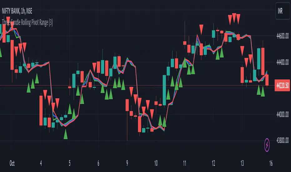
Three Candle Rolling Pivot Range**Strategy Description: Three Previous Candle Rolling Pivot Range**
**Introduction:**
This trading strategy is based on the concept of the rolling pivot range calculated from the high, low, and close prices of the three previous candles. The rolling pivot range serves as a dynamic support and resistance level, and this strategy aims to capture potential trading opportunities based on the price relationship with this range.
**Strategy Components:**
**1. Rolling Pivot Range Calculation:**
- **Rolling Pivot:** Calculate the rolling pivot by averaging the high, low, and close prices of the three previous candles.
- **Second Number:** Find the midpoint between the high and low of the three previous candles.
- **Pivot Differential:** Measure the difference between the rolling pivot and the second number.
- **Rolling Pivot Range High:** Set as rolling pivot + pivot differential.
- **Rolling Pivot Range Low:** Set as rolling pivot - pivot differential.
**2. Entry Rules:**
- **Long Entry:**
- Initiate a long entry when the current close is above both the rolling pivot range high and the rolling pivot.
- Continue the long entry as long as both the rolling pivot range high and low are higher than the corresponding values of the previous candle.
- **Short Entry:**
- Start a short entry when the current close is below both the rolling pivot range high and the rolling pivot.
- Continue the short entry as long as both the rolling pivot range high and low are lower than the corresponding values of the previous candle.
**Visualization:**
- **Plotting:**
- The rolling pivot range high, rolling pivot, and rolling pivot range low are plotted on the chart for visual reference.
- Long entry points are marked with a green triangle below the corresponding candle.
- Short entry points are marked with a red triangle above the corresponding candle.
**Conclusion:**
This strategy leverages the rolling pivot range to identify potential reversal points in the market. By considering the relative position of the current price compared to the dynamic support and resistance levels, the strategy aims to capture favorable trading opportunities. However, like all trading strategies, it should be used cautiously and backtested thoroughly on historical data to ensure its effectiveness before implementation in a live trading environment. Additionally, risk management techniques should always be applied to safeguard trading capital.
Intraday Intensity Index [SyntaxGeek]Intraday Intensity Index
This is a volume-based technical indicator that integrates volume with a security’s price. Use this to follow how intraday highs and lows are moving with volume.
The Intraday Intensity Index was developed by Dave Bostian.
It is one of several indicators that can be used to follow how volume is influencing a security’s price. It provides a continuous volume-focused indicator by using a security’s most recent close, high and low in its calculation while also factoring in volume.
I've searched high and low for the correct implementation of this measure and I can only find it buried within old books or in PineScript's own ta.iii, but no one has provided it as a histogram indicator correctly.
The main difference I can find is that most are not restricting volumes influence to the denominator solely, which is how Dave designed it.
For illustration the correct implementation is:
(2 * close - high - low) / ((high - low) * volume)
Such a simple change but compare to many other indicators that claim to implement the measure and it's easy to see the difference.
I also provided a high/low mode that aims to ease comparison to Bollinger Bands which is something that John Bollinger references when utilizing III.
Setting III to 20 trend and high/low mode can present similar areas of extreme breaks to the high or low and may be great entries for trades but you must complete your own analysis.

YinYang Bar ForecastOverview:
YinYang Bar Forecast is a prediction indicator. It predicts the movement for High, Low, Open and Close for up to 13 bars into the future. We created this Indicator as we felt the TradingView community could benefit from a bar forecast as there wasn’t any currently available.
Our YinYang Bar Forecast is something we plan on continuously working on to better improve it, but at its current state it is still very useful and decently accurate. It features many calculations to derive what it thinks the future bars will hold. Let’s discuss some of the logic behind it:
Each bar has its High, Low, Open and Close calculated individually for highest accuracy. Within these calculations we first check which bar it is we are calculating and base our span back length that we are getting our data from based on the bar index we are generating. This helps us get a Moving Average for this bar index.
We take this MA and we apply our Custom Volume Filter calculation on it, which is essentially us dividing the current bars volume over the average volume in the last ‘Filtered Length’ (Setting) length. We take this decimal and multiply it on our MA and smooth it out with a VWMA.
We take the new Volume Filtered MA and apply a RSI Filter calculation on it. RSI Filter is where we take the difference between the high and low of this bar and we multiply it with an RSI calculation using our Volume Filtered MA. We take the result of that multiplication and either add or subtract it from the Volume Filtered MA based on if close > open. This makes our RSI Filtered MA.
Next, we do an EMA Strength Calculation which is where we check if close > ema(close, ‘EMA Averaged Length’) (Setting). Based on this condition we assign a multiplier that is applied to our RSI Filtered MA. We divide by how many bars we are predicting and add a bit to each predictive bar so that the further we go into the future the stronger the strength is.
Next we check RSI and RSI MA levels and apply multiplications based on its RSI levels and if it is greater than or less than the MA. Also it is affected by if the RSI is <= 30 and >= 70.
Finally we check the MFI and MFI MA levels and like RSI we apply multiplications based on its MFI levels and if it is greater than or less than the MA. It is also affected by if the MFI is <= 30 and >= 70.
Please note the way we calculate this may change in the future, this is just currently what we deemed works best for forecasting the future bars. Also note this script uses MA calculations out of scope for efficiency but there is potential for inconsistencies.
Innately it’s main use is the projection it provides. It only draws the bars for realtime bars and not historical ones, so the best way to backtest it is with TradingView’s Replay Tool.
Well, enough of the logic behind it, let's get to understanding how to use it:
Tutorial:
So unfortunately we aren’t able to plot legit bars/candles into the future so we’ve had to do a bit of a work around using lines and fills. As you can see here we have 4 Lines and 3 Zones:
Lines:
Green: Represents the High
Orange: Represents the Open
Teal: Represents the Close
Red: Represents the Low
Zones:
High Zone: This zone is from either Open or Close to the High and is ALWAYS filled with Green.
Open/Close Zone: This zone is from the Open to the Close and is filled with either Green or Red based on if it's greater than the previous bar (real or forecasted).
Low Zone: This zone is from either Open or Close to the Low and is ALWAYS filled with Red.
As you can see generally the Forecasted bars are generally within strong pivot locations and are a good estimation of what will likely go on. Please note, the WHOLE structure of the prediction can change based on the current bars movements and the way it affects the calculations.
Let's look 1 bar back from the current bar just so we can see what it used to Forecast:
As you can see it has changed quite a bit from the previous bar, but if you look close, we drew horizontal lines around where its projecting the next bar to be (our current realtime bar), if we go back to the live chart:
Its projections were pretty close for the high and low. Generally, right now at least, it does a much better job at predicting the high and low than it does the open and close, however we will do our best to fine tune that in future updates.
Remember, this indicator is not meant to base your trades on, but rather give you a Forecast towards the general direction of the next few bars. Somewhat like weather, the farther the bar (or day for weather), the harder it is to predict. For this reason we recommend you focusing on the first few bars as they are more accurate, but review the further ones as they may help show the trend and the way that pair will move.
We will conclude this tutorial here, hopefully this Predictive Indicator can be of some help and use to you. If you have any questions, comments, ideas or concerns please let us know.
Settings:
Forecast Length: How many bars should we predict into the Future? Max 13
Each Bar Length Multiplier: For each new Forecast bar, how many more bars are averaged? Min 2
VWMA Averaged Length: All Forecast bars are put into a VWMA, what length should we use?
EMA Averaged Length: All Forecast bars are put into a EMA, what length should we use?
Filtered Length: What length should we use for Filtered Volume and RSI?
EMA Strength Length: What length should we use for the EMA Strength
HAPPY TRADING!

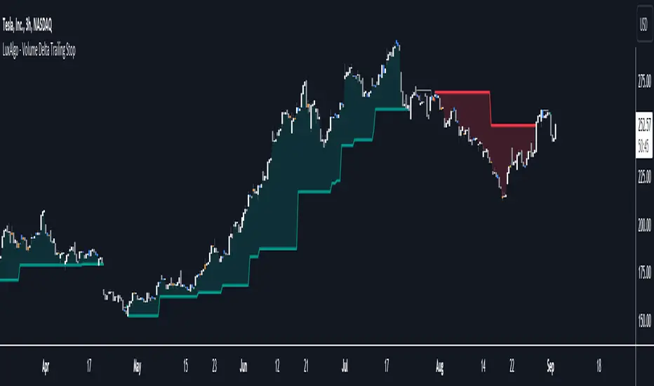
Volume Delta Trailing Stop [LuxAlgo]The ' Volume Delta Trailing Stop ' indicator uses Lower Time Frame (LTF) volume delta data which can provide potential entries together with a Volume-Delta based Trailing Stop-line .
🔶 USAGE
Our 'Volume Delta Trailing Stop' script can show potential entries/Stop Loss lines
A trigger line needs to be broken before a position is taken, after which a Volume Delta-controlled Trailing Stop-line is created:
🔶 DETAILS
🔹 Volume rises when bought or sold
🔹 When the opening price appears on the chart, a buy/sell order has been executed.
If that order is less than the available supply of that particular price, volume will rise, without moving the price.
🔹 When the opening price is the same as the closing price, the volume of that bar can be seen as "neutral volume" (nV); nor "up", nor "down" volume.
Example
A buy order doesn't fill the first available supply in the order book. This price will be the opening price with a certain volume.
When at closing time, price still hasn't moved (the first available supply in the order book isn't filled, or no movement downwards),
the closing price will be equal to the opening price, but with volume. This can be seen as "neutral volume (nV)".
🔹 Delta Volume (ΔV): this is "up volume" minus "down volume"
🔹 Standard volume is colored red when closing price is lower than opening price ( = "down volume").
🔹 Standard volume is colored green when closing price is higher OR equal (nV) than opening price ( = "up volume").
🔹 Neutral Volume
The "Neutral-Volume" is considered "Up-Volume" - setting will dictate whether nV is considered as green 'buy' volume or not.
🔶 EXAMPLE
29 July 10:00 -> 10:05, chart timeframe 5 minutes, open 29311.28, close 29313.89
close > open, so the volume (39.55) is colored green ("up volume").
(The Volume script used in the following examples is the open-source publication Volume Columns w. Alerts (V) from LucF )
Let's zoom to the 1-minute TF:
The same period is now divided into more bars, volume direction (color) is dependable on the difference between open and close.
Counting up and down volume gives a more detailed result, it remains in an upward direction though):
(ΔV = +15.51)
Let's further zoom in to the 1-second TF:
The same period is now divided into even more bars (more possibility for changing direction on each bar)
Here we see several bars that haven't moved in price, but they have volume ("neutral" volume).
(neutral volume is coloured light green here, while up volume is coloured darker green)
When we count all green and red volume bars, the result is quite different:
(ΔV = -0.35)
In total more volume is found when price went downwards, yet price went up in these 5 minutes.
-> This is the heart of our publication, when this divergence occurs, you can see a barcolor changement:
• orange: when price went up, but LTF Volume was mainly in a downward direction.
• blue: when price went down, but LTF Volume was mainly in an upwards direction.
When we split the green "up volume" into "up" and "neutral", the difference is even higher
(here "neutral volume" is colored grey):
(ΔV = -12.76; "up" - "down")
🔶 CONCEPTS
bullishBear = current bar is red but LTF volume is in upward direction -> blue bar
bearishBull = current bar is green but LTF volume is in downward direction -> orange bar
🔹 Potential positioning - forming of Trigger-line
When not in position, the script will wait for a divergence between price and volume direction. When found, a Trigger-line will appear:
• at high when a blue bar appears ( bullishBear ).
• at low when an orange bar appears ( bearishBull ).
Next step is when the Trigger-line is broken by close or high/low (settings: Trigger )
Here, the closing price went under the grey Trigger-line -> bearish position:
🔹 Trailing Stop-line
When the Trigger-line is broken, the Trailing Stop-line (TS-line) will start:
• low when bullish position
• high when bearish position
You can choose (settings -> Trigger -> Close or H/L ) whether close price or high/low should break the Trigger-line
When alerts are enabled ("Any alert() function call"), you'll get the following message:
• ' signal up ' when bullish position
• ' signal down' when bearish position
After that, the TS-line will be adjusted when:
• a blue bullishBear bar appears when in bullish position -> lowest of {low , previous blue bar's high or orange bar's low}
• an orange bearishBull bar appears when in bearish position -> highest of {high, previous blue bar's high or orange bar's low}
When alerts are enabled ("Any alert() function call"), and the TS-line is broken, you'll get the following message:
• ' TS-line broken down ' when out bullish position
• ' TS-line broken up ' when out bearish position
🔹 Reference Point
Default the direction of price will be evaluated by comparing closing price with opening price.
When open and close are the same, you'll get "neutral volume".
You can use "previous close" instead (as in built-in volume indicator) to include gaps.
If close equals open , but close is lower than previous close , it will be regarded as " down volume ",
similar, when close is higher than previous close , it will be regarded as " up volume "
Note, the setting applies for the current timeframe AND Lower timeframe:
Based on: " open " (close - open)
Based on: " previous close " (close - previous close)
🔹 Adjustment
When the TS-line changes, this can be adjusted with a percentage of price , or a multiple of " True Range "
Default (Δ line -> Adjustment - 0)
Δ line -> Adjustment 0.03% (of price)
Δ line -> Mult of TR (10)
🔶 SETTINGS
🔹 LTF: choose your Lower TimeFrame: 1S (seconds), 5S, 10S, 15S, 30S, 1 minute)
🔹 Trigger: Choose the trigger for breaking the Trigger-line ; close or H/L (high when bullish position, low when bearish position)
🔹 Δ line ( Trailing Stop-line ): add/subtract an adjustment when the TS-line changes ( default: Adjustment ):
• Adjustment ( default: 0 ): add/subtract an extra % of price
• Mult of TR : add/subtract a multiple of True Range
🔹 Based on: compare closing price against:
• open
• previous close
🔹 "Neutral-Volume" is considered "Up-Volume" : this setting will dictate whether nV is considered as green 'buy' volume or not.
🔶 CONSIDERATIONS
🔹 The lowest LTF (1S) will give you more detail and will get data close to tick data.
However, a maximum of 100,000 intrabars can be used in calculations .
This means on the daily chart you won't see anything since 1 day ~ 86400 seconds. (just over 1 bar)
-> choose a lower chart timeframe, or choose a higher LTF (5S, 10S, ... 1 minute)
🔹 Always choose a LTF lower than the current chart timeframe.
🔹 Pine Script™ code using this request.security_lower_tf() may calculate differently on historical and real-time bars, leading to repainting .
Globex, Extended, Daily, Weekly, Monthly, Yearly Range* Adds Right Side Only Price Line & Labels for Tracking without Extending Both Sides
* Tracks Current, Previous, and Two Previous Globex Sessions/ Futures:
* Tracks Current, Previous, and Two Previous Extended Session/ Stocks:
* Tracks Current, Previous, Two, & Three Previous Day Session/ Equities:
* Tracks Current, Last, Two, Three, Four, & Five Week Session/ Equities:
* Tracks Current, Last, Two, Three, Four, & Five Month Session/ Equities:
* Tracks Current, Last, Two, Three, Four, & Five Year Session/ Equities:
* Allows Custom Range on Globex, Extended, & Daily Sessions
* Allows Custom Range on Weekly, Monthly, & Yearly Sessions
* Lines & Labels Are Not Visible on Chart Scales
* Reversible Text & Background Color
* Lines Extend Accordingly with Range
* Labels show Price & Percent Change
* Background Colors should match Chart Color to avoid Overlapping Text & Labels
* Lines have Offset Extension
* Labels have Offset Extension
* Globex Session is only visible on Futures & if Current Timeframe is Intraday
* Extended Session is only visible on Stocks & if Current Timeframe is Intraday
* Daily, Weekly, Monthly, & Yearly Sessions are visible on All Symbols & All Timeframes
* Globex, Extended, & Regular use their Default Time Sessions but allow Customization
* For Back Testing Default Sessions, switch over on the Menu to Style and Turn On/Off their Background Color; Any Area on the Chart Without Background Color is Regular Session
HILOCLOP AnalysisThe "HILOCLOP Analysis" indicator is designed to analyze price data based on different conditions and provide insights into market trends and patterns. Let's break down its features and understand its potential usefulness in trading:
Sample Length: The indicator allows the user to specify the sample length, which determines the number of bars or periods considered for the analysis. This parameter can be adjusted to capture short-term or long-term trends and patterns in the market.
Raw Up/Down Analysis: The indicator calculates the number of occurrences where the current price values (high, low, open, close) are higher or lower than their previous values. It provides separate counts for each price component. By visualizing these counts on the chart, traders can identify periods of upward or downward movement in the price data.
HICLOP Analysis: The indicator offers a color scheme option called "HICLOP," which determines the color of the plotted results. If the HICLOP analysis is enabled, the plots representing raw up/down counts will have different colors based on whether the current count is higher or lower than the previous count. This color coding helps traders quickly identify changes in price trends.
Unchecking this Box will Show the general trend.
Raw HICLOP Color Scheme
Trend Color Scheme
Analysis Up vs. Down: The indicator provides an option to analyze instances where all four price components (high, low, open, close) are higher or lower than their respective previous values. This analysis helps traders identify periods of strong upward or downward movement in the market.
Analysis High vs. Low: The indicator compares the number of occurrences where the current high is higher than the previous high and the current low is higher than the previous low. It provides insights into whether the market is experiencing higher highs or higher lows, which can help traders determine the strength of an upward or downward trend.
Analysis Open vs. Close: The indicator compares the number of occurrences where the current close is higher than the previous close and the current open is higher than the previous open. This analysis helps traders assess the relationship between opening and closing prices, providing insights into the strength of buying or selling pressure in the market.
The usefulness of the "HILOCLOP Analysis" indicator in trading depends on the specific trading strategy and the trader's preferences. Here are a few potential use cases:
Trend Identification: By analyzing the raw up/down counts and the HICLOP color scheme, traders can identify trends and changes in price momentum. Increasing raw up counts and corresponding color changes to positive values may indicate an upward trend, while increasing raw down counts and negative color changes may suggest a downward trend.
Confirmation of Breakouts: Traders often look for confirmation of breakouts from key levels or chart patterns. The "Analysis Up V Dn" feature can help identify instances where all four price components simultaneously confirm a breakout, indicating a potentially significant move in the market.
Trend Reversals: The "Analysis High V Low" and "Analysis Open V Close" features can provide insights into potential trend reversals. For example, if there are more higher highs than higher lows, it may indicate a weakening trend, potentially signaling a reversal or a correction.

Volume-based Support & Resistance Zones-V1 By Trade Mastership™ The all-new Support & Resistance Zones indicator, which has been upgraded to offer traders more powerful features and functionality. This innovative indicator identifies high-volume fractal lows or highs to create zones based on the size of the wick for that timeframe's candle. This makes it easy for traders to visualize which price levels are the most significant for either a trend continuation or a reversal when zones are broken and retested.
The original script for this indicator was created by Trade Mastership, with additional modifications by L N Behera. Credit goes to both of them for the majority of the logic behind this script. Since then, the script has been improved with several changes, including:
Changing the default S/R lines from plots to lines, and giving users the option to change between solid, dashed, or dotted lines for both S/R lines
Adding additional timeframes and more options for TF1, beyond the current TF. Now, users have four timeframes to plot S/R zones from
Giving users the option to easily change the line thickness for all S/R lines
Making it easier to change the colors of S/R lines and zones by consolidating the options under settings (rather than under style)
Adding extensions to active SR Zones to extend all the way right
Adding the option to extend or not extend the previous S/R zones up to the next S/R zone
Adding optional timeframe labels to active S/R zones, with left and right options, as well as the option to adjust how far to the right the label is set
Fixing an issue where the higher timeframe S/R zone was not properly starting from the high/low of fractal. Now, any higher timeframe S/R will begin exactly at the High/Low points. Note that this may not work perfectly on stocks, and if a fractal high/low is too many bars in the past, it will revert to a default max bars back to avoid script errors.
Adding a function to prevent S/R zones from lower timeframes displaying while on a higher timeframe. This helps clean up the chart quite a bit.
Creating arrays for each timeframe's boxes and lines so that the number of S/R zones can be controlled for each timeframe and limit memory consumption.
Adding new alert options and customized alert messages
Here's how this indicator works: it looks for fractal highs or fractal lows with volume that pierces above the volume's Moving Average. This moving average value can be modified in the settings for each timeframe. The fractal highs will be confirmed with three successive higher highs followed by two successive lower highs and vice versa for the fractal lows. The zone is created from the fractal high/low and the close of the candle for whatever timeframe you selected. The bigger the zone, the more significant that zone is.
Traders can disable any zone, change the zones to show lines only, and modify all the colors, transparencies, and thickness of lines for all the zones. To create alerts, traders can enable the types of alerts they want for each timeframe in the indicator's settings. After applying changes, right-click on one of the zones on the chart, and click "Add Alert on Vol S/R Zones." You do not need to add a title, as the correct alert messages are already built-in.
The latest update has migrated the script to Pine Script Version 5 and added a higher number of total boxes/lines to show on the chart. It has also increased the max bars count to the maximum Pine Script allows, enabling traders to utilize as many bars as possible when drawing the left side of SR zones that are very far back on the chart. Additionally, the update fixed issues where the indicator would not load on 1 minute and 3-minute charts unless higher timeframe SR zones

Double Trends [theEccentricTrader]█ OVERVIEW
This indicator simply plots multi-part double trends and should be used in conjunction as a visual aid to my Double Trend Counter indicator.
█ CONCEPTS
Green and Red Candles
• A green candle is one that closes with a close price equal to or above the price it opened.
• A red candle is one that closes with a close price that is lower than the price it opened.
Swing Highs and Swing Lows
• A swing high is a green candle or series of consecutive green candles followed by a single red candle to complete the swing and form the peak.
• A swing low is a red candle or series of consecutive red candles followed by a single green candle to complete the swing and form the trough.
Peak and Trough Prices (Basic)
• The peak price of a complete swing high is the high price of either the red candle that completes the swing high or the high price of the preceding green candle, depending on which is higher.
• The trough price of a complete swing low is the low price of either the green candle that completes the swing low or the low price of the preceding red candle, depending on which is lower.
Historic Peaks and Troughs
The current, or most recent, peak and trough occurrences are referred to as occurrence zero. Previous peak and trough occurrences are referred to as historic and ordered numerically from right to left, with the most recent historic peak and trough occurrences being occurrence one.
Upper Trends
• A return line uptrend is formed when the current peak price is higher than the preceding peak price.
• A downtrend is formed when the current peak price is lower than the preceding peak price.
• A double-top is formed when the current peak price is equal to the preceding peak price.
Lower Trends
• An uptrend is formed when the current trough price is higher than the preceding trough price.
• A return line downtrend is formed when the current trough price is lower than the preceding trough price.
• A double-bottom is formed when the current trough price is equal to the preceding trough price.
Muti-Part Upper and Lower Trends
• A multi-part return line uptrend begins with the formation of a new return line uptrend and continues until a new downtrend ends the trend.
• A multi-part downtrend begins with the formation of a new downtrend and continues until a new return line uptrend ends the trend.
• A multi-part uptrend begins with the formation of a new uptrend and continues until a new return line downtrend ends the trend.
• A multi-part return line downtrend begins with the formation of a new return line downtrend and continues until a new uptrend ends the trend.
Double Trends
• A double uptrend is formed when the current trough price is higher than the preceding trough price and the current peak price is higher than the preceding peak price.
• A double downtrend is formed when the current peak price is lower than the preceding peak price and the current trough price is lower than the preceding trough price.
Muti-Part Double Trends
• A multi-part double uptrend begins with the formation of a new uptrend that proceeds a new return line uptrend, and continues until a new downtrend or return line downtrend ends the trend.
• A multi-part double downtrend begins with the formation of a new downtrend that proceeds a new return line downtrend, and continues until a new uptrend or return line uptrend ends the trend.
█ FEATURES
Plots
Green up-arrows, with the number of the double trend part, denote double uptrends. Red down-arrows, with the number of the double trend part, denote double downtrends.
█ LIMITATIONS
Some higher timeframe candles on tickers with larger lookbacks such as the DXY , do not actually contain all the open, high, low and close (OHLC) data at the beginning of the chart. Instead, they use the close price for open, high and low prices. So, while we can determine whether the close price is higher or lower than the preceding close price, there is no way of knowing what actually happened intra-bar for these candles. And by default candles that close at the same price as the open price, will be counted as green.
The green and red candle calculations are based solely on differences between open and close prices, as such I have made no attempt to account for green candles that gap lower and close below the close price of the preceding candle, or red candles that gap higher and close above the close price of the preceding candle. I can only recommend using 24-hour markets, if and where possible, as there are far fewer gaps and, generally, more data to work with. Alternatively, you can replace the scenarios with your own logic to account for the gap anomalies, if you are feeling up to the challenge.

Double Trend Counter [theEccentricTrader]█ OVERVIEW
This indicator counts the number of confirmed double trend scenarios on any given candlestick chart and displays the statistics in a table, which can be repositioned and resized at the user's discretion.
█ CONCEPTS
Green and Red Candles
• A green candle is one that closes with a close price equal to or above the price it opened.
• A red candle is one that closes with a close price that is lower than the price it opened.
Swing Highs and Swing Lows
• A swing high is a green candle or series of consecutive green candles followed by a single red candle to complete the swing and form the peak.
• A swing low is a red candle or series of consecutive red candles followed by a single green candle to complete the swing and form the trough.
Peak and Trough Prices (Basic)
• The peak price of a complete swing high is the high price of either the red candle that completes the swing high or the high price of the preceding green candle, depending on which is higher.
• The trough price of a complete swing low is the low price of either the green candle that completes the swing low or the low price of the preceding red candle, depending on which is lower.
Historic Peaks and Troughs
The current, or most recent, peak and trough occurrences are referred to as occurrence zero. Previous peak and trough occurrences are referred to as historic and ordered numerically from right to left, with the most recent historic peak and trough occurrences being occurrence one.
Upper Trends
• A return line uptrend is formed when the current peak price is higher than the preceding peak price.
• A downtrend is formed when the current peak price is lower than the preceding peak price.
• A double-top is formed when the current peak price is equal to the preceding peak price.
Lower Trends
• An uptrend is formed when the current trough price is higher than the preceding trough price.
• A return line downtrend is formed when the current trough price is lower than the preceding trough price.
• A double-bottom is formed when the current trough price is equal to the preceding trough price.
Muti-Part Upper and Lower Trends
• A multi-part return line uptrend begins with the formation of a new return line uptrend and continues until a new downtrend ends the trend.
• A multi-part downtrend begins with the formation of a new downtrend and continues until a new return line uptrend ends the trend.
• A multi-part uptrend begins with the formation of a new uptrend and continues until a new return line downtrend ends the trend.
• A multi-part return line downtrend begins with the formation of a new return line downtrend and continues until a new uptrend ends the trend.
Double Trends
• A double uptrend is formed when the current trough price is higher than the preceding trough price and the current peak price is higher than the preceding peak price.
• A double downtrend is formed when the current peak price is lower than the preceding peak price and the current trough price is lower than the preceding trough price.
Muti-Part Double Trends
• A multi-part double uptrend begins with the formation of a new uptrend that proceeds a new return line uptrend, and continues until a new downtrend or return line downtrend ends the trend.
• A multi-part double downtrend begins with the formation of a new downtrend that proceeds a new return line downtrend, and continues until a new uptrend or return line uptrend ends the trend.
█ FEATURES
Inputs
• Start Date
• End Date
• Position
• Text Size
Table
The table is colour coded, consists of seven columns and, as many as, fifteen rows. Blue cells denote the multi-part trend scenarios, green cells denote the corresponding double uptrend scenarios and red cells denote the corresponding double downtrend scenarios.
The double trend scenarios are listed in the first column with their corresponding total counts to the right, in the second and fifth columns. The last row in column one, displays the sample period which can be adjusted or hidden via indicator settings.
The third and sixth columns display the double trend scenarios as percentages of total 1-part double trends. And columns four and seven display the total double trend scenarios as percentages of the last, or preceding double trend part. For example, 4-part double trends as percentages of 3-part double trends and so on.
Plots
For a visual aid to this indicator please use in conjunction with my Double Trends indicator which can be found on my profile page under scripts, or in community scripts under the same name.
Green up-arrows, with the number of the double trend part, denote double uptrends. Red down-arrows, with the number of the double trend part, denote double downtrends.
█ HOW TO USE
This indicator is intended for research purposes, strategy development and strategy optimisation. I hope it will be useful in helping to gain a better understanding of the underlying dynamics at play on any given market and timeframe.
It can, for example, give you an idea of whether the current double trend will continue or fail, based on the current double trend scenario and what has happened in the past under similar circumstances. Such information can be very useful when conducting top down analysis across multiple timeframes and making strategic decisions.
What you do with these statistics and how far you decide to take your research is entirely up to you, the possibilities are endless.
█ LIMITATIONS
Some higher timeframe candles on tickers with larger lookbacks such as the DXY , do not actually contain all the open, high, low and close (OHLC) data at the beginning of the chart. Instead, they use the close price for open, high and low prices. So, while we can determine whether the close price is higher or lower than the preceding close price, there is no way of knowing what actually happened intra-bar for these candles. And by default candles that close at the same price as the open price, will be counted as green. You can avoid this problem by utilising the sample period filter.
The green and red candle calculations are based solely on differences between open and close prices, as such I have made no attempt to account for green candles that gap lower and close below the close price of the preceding candle, or red candles that gap higher and close above the close price of the preceding candle. I can only recommend using 24-hour markets, if and where possible, as there are far fewer gaps and, generally, more data to work with. Alternatively, you can replace the scenarios with your own logic to account for the gap anomalies, if you are feeling up to the challenge.
It is also worth noting that the sample size will be limited to your Trading View subscription plan. Premium users get 20,000 candles worth of data, pro+ and pro users get 10,000, and basic users get 5,000. If upgrading is currently not an option, you can always keep a rolling tally of the statistics in an excel spreadsheet or something of the like.

Candle Trend Counter [theEccentricTrader]█ OVERVIEW
This indicator counts the number of confirmed candle trend scenarios on any given candlestick chart and displays the statistics in a table, which can be repositioned and resized at the user's discretion.
█ CONCEPTS
Green and Red Candles
• A green candle is one that closes with a high price equal to or above the price it opened.
• A red candle is one that closes with a low price that is lower than the price it opened.
Swing Highs and Swing Lows
• A swing high is a green candle or series of consecutive green candles followed by a single red candle to complete the swing and form the peak.
• A swing low is a red candle or series of consecutive red candles followed by a single green candle to complete the swing and form the trough.
Muti-Part Green and Red Candle Trends
• A multi-part green candle trend begins upon the completion of a swing low and continues until a red candle completes the swing high, with each green candle counted as a part of the trend.
• A multi-part red candle trend begins upon the completion of a swing high and continues until a green candle completes the swing low, with each red candle counted as a part of the trend.
█ FEATURES
Inputs
Start Date
End Date
Position
Text Size
Show Sample Period
Show Plots
Table
The table is colour coded, consists of seven columns and, as many as, thirty-one rows. Blue cells denote the multi-part candle trend scenarios, green cells denote the corresponding green candle trend scenarios and red cells denote the corresponding red candle trend scenarios.
The candle trend scenarios are listed in the first column with their corresponding total counts to the right, in the second column. The last row in column one, displays the sample period which can be adjusted or hidden via indicator settings.
The third column displays the total candle trend scenarios as percentages of total 1-candle trends, or complete swing highs and swing lows. And column four displays the total candle trend scenarios as percentages of the, last, or preceding candle trend part. For example 4-candle trends as a percentage of 3-candle trends. This offers more insight into what might happen next at any given point in time.
Plots
I have added plots as a visual aid to the various candle trend scenarios listed in the table. Green up-arrows, with the number of the trend part, denote green candle trends. Red down-arrows, with the number of the trend part, denote red candle trends.
█ HOW TO USE
This indicator is intended for research purposes, strategy development and strategy optimisation. I hope it will be useful in helping to gain a better understanding of the underlying dynamics at play on any given market and timeframe.
It can, for example, give you an idea of whether the next candle will close higher or lower than it opened, based on the current scenario and what has happened in the past under similar circumstances. Such information can be very useful when conducting top down analysis across multiple timeframes and making strategic decisions.
What you do with these statistics and how far you decide to take your research is entirely up to you, the possibilities are endless.
█ LIMITATIONS
Some higher timeframe candles on tickers with larger lookbacks such as the DXY , do not actually contain all the open, high, low and close (OHLC) data at the beginning of the chart. Instead, they use the close price for open, high and low prices. So, while we can determine whether the close price is higher or lower than the preceding close price, there is no way of knowing what actually happened intra-bar for these candles. And by default candles that close at the same price as the open price, will be counted as green. You can avoid this problem by utilising the sample period filter.
The green and red candle calculations are based solely on differences between open and close prices, as such I have made no attempt to account for green candles that gap lower and close below the close price of the preceding candle, or red candles that gap higher and close above the close price of the preceding candle. I can only recommend using 24-hour markets, if and where possible, as there are far fewer gaps and, generally, more data to work with. Alternatively, you can replace the scenarios with your own logic to account for the gap anomalies, if you are feeling up to the challenge.
It is also worth noting that the sample size will be limited to your Trading View subscription plan. Premium users get 20,000 candles worth of data, pro+ and pro users get 10,000, and basic users get 5,000. If upgrading is currently not an option, you can always keep a rolling tally of the statistics in an excel spreadsheet or something of the like.

Pullback IndicatorThe Pullback Indicator is a technical analysis tool designed to identify pullbacks in the price action of a financial instrument. It is based on the concept that price tends to retrace to a previous level of support or resistance before continuing in the direction of the trend.
The indicator is plotted as a series of triangles above or below the price bars, depending on the type of pullback detected. A green triangle is displayed when a bullish pullback is detected, while a red triangle is displayed for a bearish pullback.
The Pullback Indicator uses Inside Bar Range, this number is a user-defined input that specifies the number of bars to look back for the highest high and lowest low.
The indicator classifies four types of pullbacks:
Swing Low - When the price forms a lower low and a higher low than the previous bar.
Swing High - When the price forms a higher high and a lower high than the previous bar.
High Low Sweep and close below - When the price forms a lower low and a higher low than the previous bar, but the close is below the previous high.
High Low Sweep and close above - When the price forms a higher high and a lower high than the previous bar, but the close is above the previous low.
The Pullback Indicator is best used in conjunction with other technical analysis tools to confirm the direction of the trend and to identify potential entry and exit points.
Inter-Exchanges Crypto Price Spread Clouds (Tartigradia)Display variations in min-max and median values of high, low and close across exchanges. It's a kind of realized volatility indicator, as the idea is that in times of high volatility (high emotions, fear, uncertainty), it's more likely that market inefficiencies will appear for the same asset between different market makers, ie, the price can temporarily differ a lot. This indicator will catch these instants of high differences between exchanges, even if they lasted only an instant (because we use high and low values).
Compared with my other "Inter-Exchanges Crypto Price Spread Deviation" indicator, this one overlays directly on the chart, and offers a different take based on the same premisses. Instead of summarizing volatility via standard deviation, here we display clouds of the range of values that were observed.
A big advantage of this approach is that it can also be used to determine safe stop loss levels, especially the values of percentile rank (i.e., what are the high values that were observed in at least 50% of exchanges?).
Indeed, all price levels are displayed in the indicator's status bar:
green for high values,
red for low values,
aqua for median,
purple for average,
The first two values are max and min values of high across exchanges (in green).
The next two values are max and min of low across exchanges (in red).
The next two values are median (aqua) and average (purple).
The last two values are percentile rank values for high (green) and low (red) respectively.
Another advantage is that the high (green) vs low (red) clouds can be seen as representing the buying or selling pressure respectively across exchanges, and this may in itself provide a signal to know whether one side is winning.
Link to my other complementary indicator:
Compared to other inter-exchanges spread indicators, this one offers two major features:
The symbol automatically adapts to the symbol currently selected in user's chart. Hence, switching between tickers does not require the user to modify any option, everything is dynamically updated behind the scenes.
It's easy to add more exchanges (requires some code editing because PineScript v5 does not allow dynamical request.security() calls).
Limitations/things to know:
History is limited to what the ticker itself display. Ie, even if the exchanges specified in this indicator have more data than the ticker currently displayed in the user's chart, the indicator will show only a timeperiod as long as the chart.
The indicator can manage multiple exchanges of different historical length (ie, some exchanges having more data going way earlier in the past than others), in which case they will simply be ignored from calculations when far back in the past. Hence, you should be aware that the further you go in the past, the less exchanges will have such data, and hence the less accurate the measures will be (because the deviation will be calculated from less sources than more recent bars). This is thanks to how the array.* math functions behave in case of na values, they simply skip them from calculations, contrary to math.* functions.

Previous Levels With Custom TimeZoneThe Previous Levels With Custom TimeZone indicator shows to users specifics price area which can be liquidity to take.
Users can determine the desired time zone to retrieve the correct daily, weekly and monthly values.
Several price area are shown with with indicator which are :
Daily Open Price
Daily Low Price
Daily High Price
Previous Daily Low Price
Previous Daily High Price
Previous Weekly Low Price
Previous Weekly High Price
Previous Monthly Low Price
Previous Monthly High Price
All price area are configurable to let user have specific color or line style for each area.
Here's some example :
Daily Open / High / Low
Previous Daily High / Low
Previous Weekly High / Low
Previous Monthly High / Low